A few website directions
Made for Fig & Thistle
A few ways your website could feel — from order-first to pure brand, each already branded to you. Take a look, then tap the one you like.
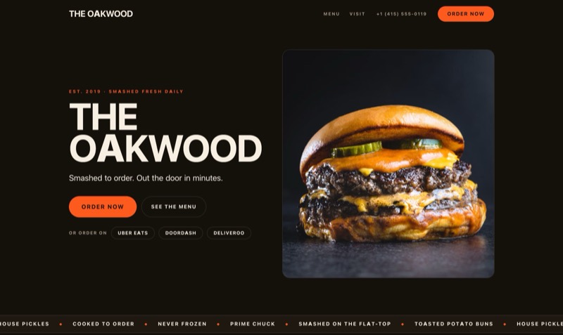
Rush
Order-first & fastFor delivery-first, high-throughput kitchens — get the tap, now.
- Sticky order bar
- Delivery apps
- High-appetite
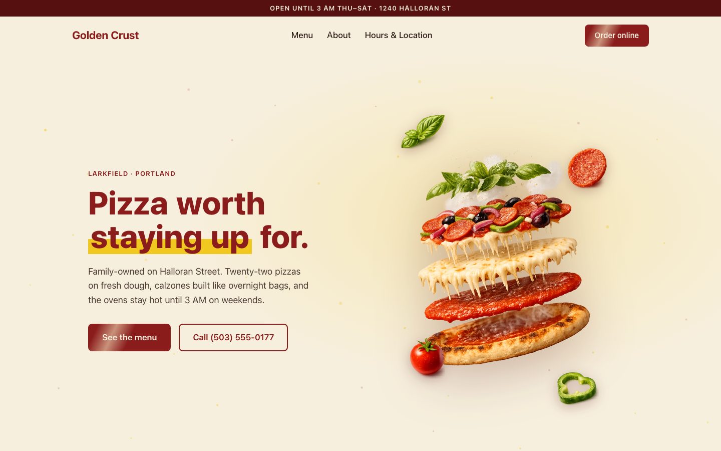
Slice
Big menu, open lateFor a long-menu neighbourhood shop where people call to order and the late hours are the hook.
- Tabbed full menu
- Parallax hero
- Call-first
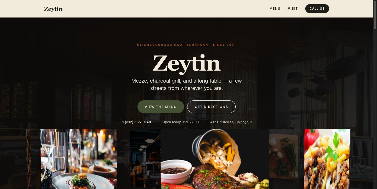
Local Favorite
Menu-forward & warmThe default — for the spot people find on Maps, then decide to visit.
- Carousel hero
- View menu + directions
- Reservations & catering
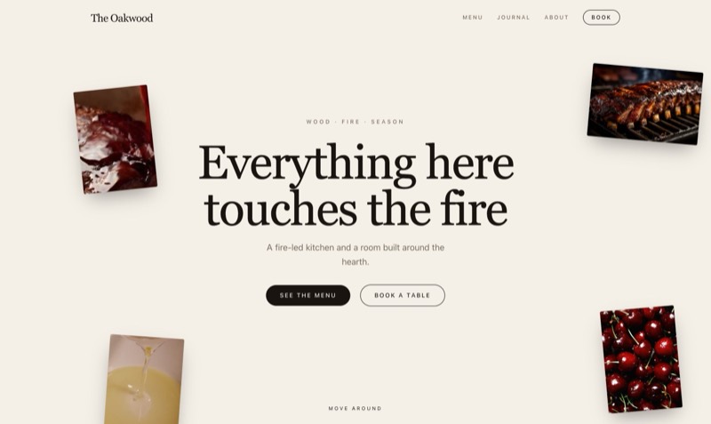
Marrow
Immersive & cinematicFor a fire-led room where the experience is the draw — photos trail the cursor.
- Cursor media-trail
- Fire-led hearth
- Slow, sensory
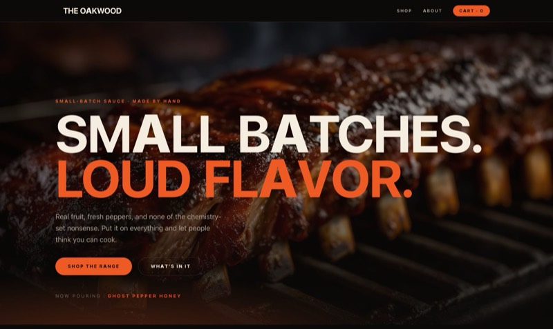
Shop
Bold & product-ledFor a house label — sauces, merch, the things people take home.
- Motion-first
- Punchy
- Retail energy
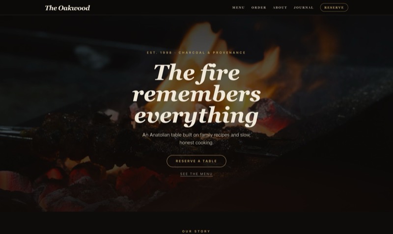
Signature
Editorial & upscaleFor destination dining where the brand is the draw.
- Story-first
- Slow scroll
- Charcoal + gold
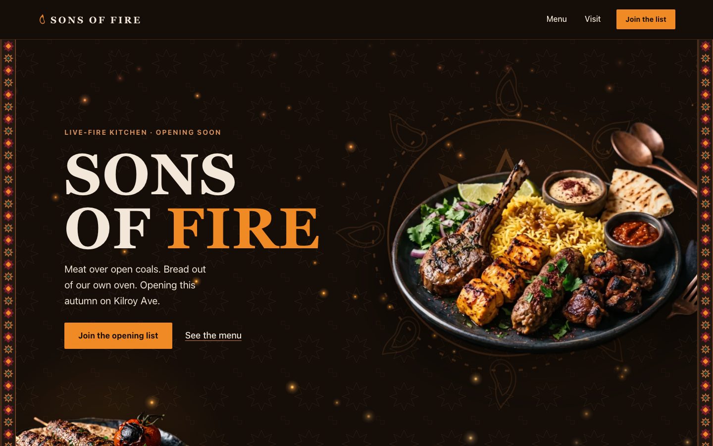
Ember
Opening soonFor a place that hasn't opened yet — no hours, no phone, no orders. One email capture carries the whole page.
- Live ember field
- Woven ornament
- Join-the-list
A personalized preview · nothing is built yet